In the upcoming ZK 8.6.0, we have added many new components. Let’s take a look at some of them!
Rating
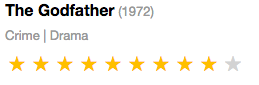
We can use <rating> component to allow user rate or display rated score.
<rating rating="9" max="10" />
The orientation can be assigned to vertical or horizontal (horizontal by default).
The default rating symbol is a star. But you can customize it by setting iconSclass like using an embedded Font Awesome icon (with a z-icon prefix) or third-party icons.
<?style src="//netdna.bootstrapcdn.com/bootstrap/3.3.7/css/bootstrap.min.css" ?>
<rating rating="3" iconSclass="z-icon-thumbs-up"/> <!-- Thumbs up -->
<rating rating="3" iconSclass="glyphicon glyphicon-heart" /> <!-- Heart -->
Cropper
This <cropper> component let users select a range of image and upload it to server for further processing.
<cropper src="/assets/world-map.png" width="1280px" height="720px"/>

Signature
The <signature> component let users draw their signatures just on the web page. It is suitable if you are building an application (contract, invoice…) that needs a signature.
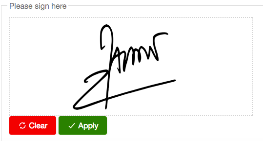
You can define the pen size, pen color and background color. Once saved, the onSave event will be triggered and you can get an Image result from the event object.
<signature penColor="blue" penSize="2" backgroundColor="#FFFFE0"
           width="400px" height="150px"/>
These components will be available in ZK 8.6. You can already try them out using the 8.6 freshly (nightly) builds. Feel free to test them and tell us how you like it!
For further information check out component reference.
