We noticed an interesting library GoldenLayout and find it useful, so here it is, a flexible and powerful layout component is now presented in ZK 8.6 – the GoldenLayout component.
Though ZK already have many useful layout components such as cross browser testing, BorderLayout and TableLayout for arranging view, GoldenLayout provides us with more choices for web view layout. GoldenLayout is a docker type layout manager, users can arrange panels by drag and drop, resize the panels with splitters or even stack all panels together.
There are two new components introduced in this GoldenLayout structure, GoldenLayout and GoldenPanel. A GoldenLayout is a root component, and accepts only GoldenPanel as its child. The GoldenPanels are listed in a flat structure, which means the order of the GoldenPanels inside the GoldenLayout is not relevant to the actual layout. The layout is defined in a GoldenLayout attribute areas, which is a very straightforward way to layout the panels. You will be seeing some examples in the following sections.
GoldenLayout Demo Video
The demo below shows how the GoldenLayout works.
[yt4wp-video video_id=”-abgQPOGkG0″]
Required Configuration
Versions:
- ZK: 8.6.0.FL.20181029 or later
example.zul
<goldenlayout id="gl" hflex="1" vflex="1" orient="vertical">
    <attribute name="areas">
        A B C
        A B C
        D D D
    </attribute>
    <goldenpanel id="project" area="A" title="Project" closable="false">
        //omitted
    </goldenpanel>
    <goldenpanel id="files" area="A" title="Files">
        //omitted
    </goldenpanel>
    <goldenpanel id="main" area="B" title="Main" droppable="false">
        //omitted
    </goldenpanel>
    <goldenpanel id="side" area="C" title="Side">
        //omitted
    </goldenpanel>
    <goldenpanel id="console" area="D" title="Console" draggable="true">
        //omitted
    </goldenpanel>
</goldenlayout>
GoldenLayout attributes:
areas: In line 2, this attribute is to specify the initial rendering layout of the GoldenLayout component. The format is to separate each area by white space, and separate each row by line break.
- Notice that this areas attribute is only for initial rendering, it is not being maintained after user re-arranges the panels.
- Also the
areas has a sugar feature for flex sizing. If the areas is A A B, hflex="2" will automatically be assigned to the GoldenPanels which area is A, and hflex="1" for those which area is B. Note that in the case where hflex or vflex is specified explicitly on the GoldenPanel component on the initial rendering, it will overwrite the proportion assigned to the areas.
- For example, if
<goldenLayout areas="A A B">, having a child <goldenPanel area="A" hflex="3">, A and B will have a width of 3:1.
orient: In line 1, this is the fist dividing orientation of the GoldenLayout layout.
For example if the areas is
A A B
A A B
C C D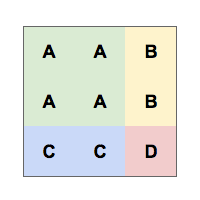 This could be divide with two ways,
- vertical:
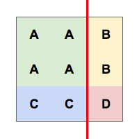
- horizontal:
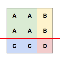
- We can see the differences above. While dragging the splitter between A and B, in the vertical dividing orientation, it’s actually the same splitter between C and D. So that B and D share the same width, A and C share the same width.
GoldenPanel attributes:
The GoldenPanel in GoldenLayout is designed in a flat manner. All the GoldenPanel should be directly added as an child of the GoldenLayout, and the order of these GoldenPanels only represents the stacking order if they are meant to be stacked.
area: in line 7, this is the location of this GoldenPanel inside the GoldenLayout. We could see, in line 7 the area is set to A, therefore ZK renders this GoldenPanel to the location A in the areas attribute of the GoldenLayout. GoldenPanels with the same area will be stacked in the order as how they are added at initial rendering.closable: in line 7, representing whether this GoldenPanel is closable or not.draggable: in line 19, set whether this GoldenPanel is draggable. If false, the GoldenPanel could not be dragged away from the current location.droppable: in line 13, represents whether this GoldenPanel is droppable by other GoldenPanels. If false, no other GoldenPanels could be dropped on this GoldenPanel.
Major APIs introduction
GoldenLayout
- addPanel
addPanel(GoldenPanel goldenPanel, int col, int row, String region)addPanel(GoldenPanel goldenPanel, String area, String region)addPanel(GoldenPanel goldenPanel, GoldenPanel targetGoldenPanel, String region)addPanelToRoot(GoldenPanel goldenPanel, String region)movePanel(GoldenPanel goldenPanel, int col, int row, String region)movePanel(GoldenPanel goldenPanel, String area, String region)movePanel(GoldenPanel goldenPanel, GoldenPanel targetGoldenPanel, String region)movePanelToRoot(GoldenPanel goldenPanel, String region)
- Among these GoldenPanel adding and moving APIs, the
goldenPanel attribute is the GoldenPanel that will be added/moved. col, row, area or targetGoldenPanel should be specified otherwise the goldenPanel will be added/moved to the $root. region is west, north, east, south or stack of the targetGoldenPanel which is the added/moved location of the goldenPanel.
GoldenPanel
- Notice that we support only
vflex and hflex to layout GoldenPanels, also notice that flex min is not supported in GoldenLayout and GoldenPanel.
Supported GoldenPanel events introduction
- onFlexSize
- Fires whenever a panel is resized, two meaningful data is provided, the hflex and vflex of the resized GoldenPanels whenever GoldenPanels are resized.
- onPanelDrop:
- Fires whenever a panel is dropped by a user action.
- onActive:
- Fires whenever a stacked panel that is not active became active.
- onClose:
- Fires whenever a panel is closed by a user action.
- onMaximize:
- Fires whenever a panel is maximized by a user action.
- onMinimize:
- Fires whenever a panel is minimized by a user action.
Downloads
The demo can be download here.
For further information check out component reference.
I hope you find this new component useful. Feel free to share with us your comments.
Greta news and great component. ¿It will be available in CE?
Wow thats very very usefull… essentially for AdminUI ´s !! Great Work Thanks vor this Innovation !! Kind Regards !!
Thanks Toby, glad that the feature is useful for you.