Introduction
We have recently upgraded ZK Charts to version 2.0. This new version will have features including
3D chart supports, new chart types, new themes and finally, hflex and vflex supports . We will
go over these new features in this post. If you are not familiar with ZK Charts component,
please head to our official ZK Charts page for more information
.
Upgrade Highlights
- 3D charts support
- Solid Gauge, Heatmap and Pyramid charts
- New themes
- Flex Support
3D Chart Supports
3D chart supports for column, pie and scatter charts are included in ZK Charts 2.0 upgrades.
Demo
Here, we will use a basic 3D column chart as a demo.
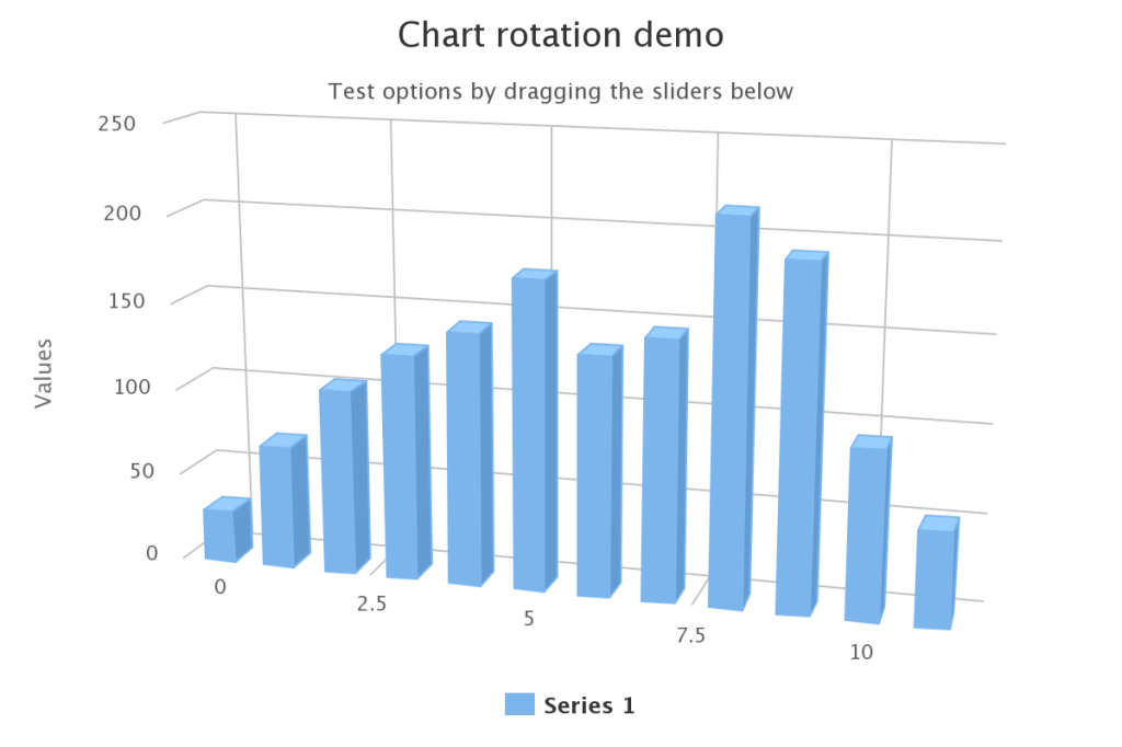
To turn a column chart into a 3D column chart is simple. All you need to do is to configure an additional
Options3D object in your controller.
public void doAfterCompose(Window comp) throws Exception {
        super.doAfterCompose(comp);
        chart.setMargin(75);
        Options3D opt3d = chart.getChart().getOptions3D();
        opt3d.setEnabled(true);
        opt3d.setAlpha(15);
        opt3d.setBeta(15);
        opt3d.setDepth(50);
        opt3d.setViewDistance(25);
        chart.setAnimation(false);
        chart.getPlotOptions().getColumn().setDepth(25);
        chart.getSeries(0).setData(
            new Double[] { 29.9, 71.5, 106.4, 129.2, 144.0, 176.0, 135.6,
                    148.5, 216.4, 194.1, 95.6, 54.4 });
        initSlider();
    }
As shown above, developers can easily adjust the vertical angle(alpha), horizontal angle(beta),
depth, and view distance of the 3D chart with the Options3D Object. Similar settings work
for 3D pie charts and 3D scatter charts as well. For detailed implementation, please refer to our
official Demo page.
New Chart Types
ZK Charts 2.0 introduces three new chart types for developers to use:
Solid Gauge Charts
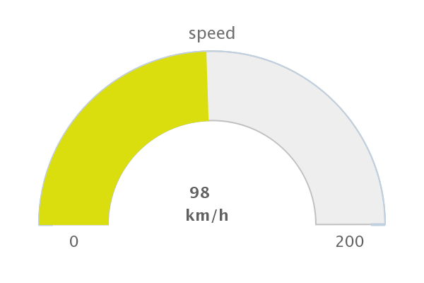
Solid gauge charts are pretty similar to the original gauge charts. However, instead of having a pointer point
to the value, solid gauge charts use solid colors to display their value. They are good for any dials or
speedometer-like charts. Check our demo page to see how to implement a solid gauge chart.
Heat map charts
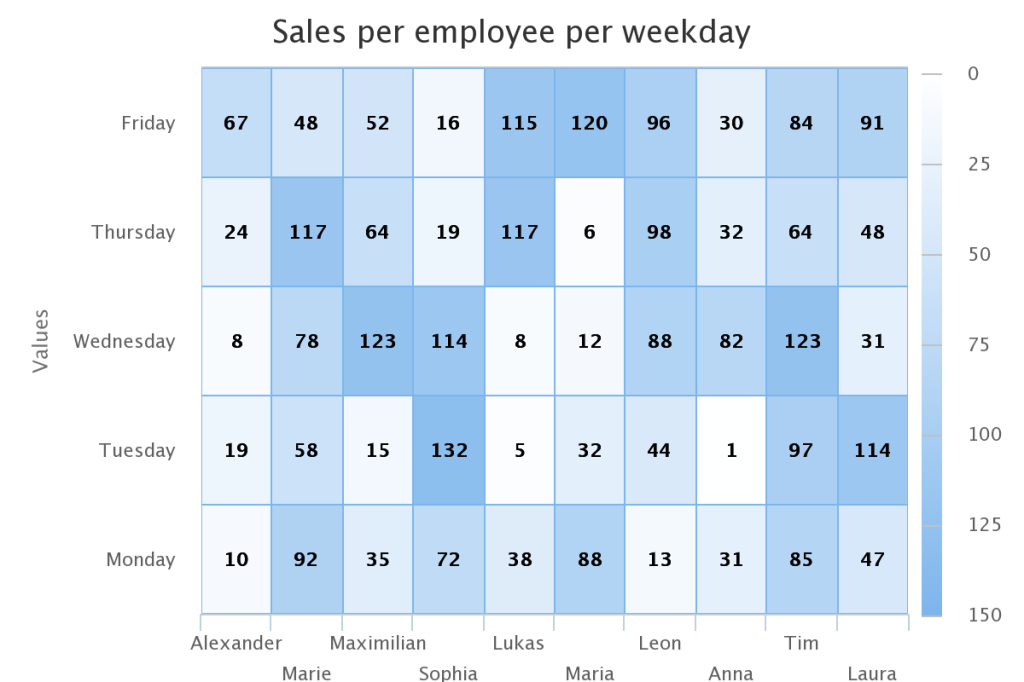
Heat map charts use graphical representation to display their values. The values are displayed as levels
of colors. Like the example given above, the deeper the color is, the larger the corresponding value is.
Check out the codes for the example showed in our heat map demo page.
Pyramid Charts
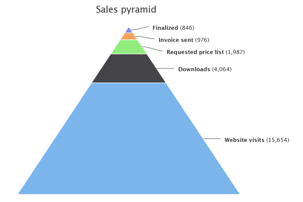
Pyramid charts are often used for visualizing stages in sales or compositions in a
group of population. Usually, the bottom represents the initial stage or the majority of a group
while further stages or other minor groups stacks as the pyramid goes narrower.
New Themes
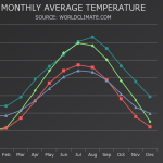
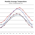
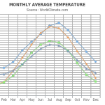
We have also introduced three new themes for users to choose from. They are (from left to right)
Dark Unica, Sand Signika and Grid Light. Please head to our demo page to see how these new
themes look like in other chart types.
Flex Support
Hflex and vflex supports are included in ZK Charts 2.0. Now, you can easily adjust your layouts by
setting hflex and vflex of your charts, just like in any other ZK Components.
Thank you very much for this improvement. I really like the FLEX support because while working with charts, it was very challenging to adjust the layouts. I upgraded hoping to enjoy this feature, but I am stack on the responsiveness of the charts.
Here is my question on forum: http://forum.zkoss.org/question/98424/zk-charts-flexibility-responsiveness/
If possible guide me how I can overcome this challenge.
Thanks