Introduction
In the upcoming ZK 8.6, we will introduce a new layout component: Organigram, and three related components: Orgchildren, Orgitem, Orgnode.
Organigram is a root component designed to display organizational chart by using tree data structure. To display a complete chart, we have to also use Orgchildren, Orgitem and Orgnode. These three components are part of the Organigram. If you have used Tree component, you will notice that the Organigram structure is very similar to the Tree structure.
Orgchildren only contains a collection of Orgitem components. It is used as the main body of the Organigram, and also as a container for the children of individual Orgitems.
Orgitem contains a node (Orgnode) and an optional Orgchildren. If Orgitem has no Orgchildren, it is a leaf node that doesn’t allow growing any child item. If it has Orgchildren, it is a branch node that may be expanded with children Orgitems.
Orgnode represents data in an Orgitem. Orgnode can contain any ZK components in it, such as label, image, textbox etc.
Example
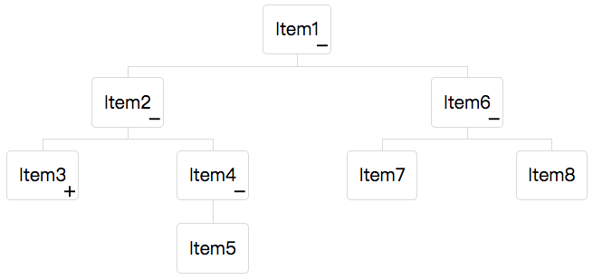
<organigram width="600px">
   <orgchildren>
      <orgitem>
         <orgnode label="Item1"/>
         <orgchildren>
            <orgitem>
               <orgnode label="Item2"/>
               <orgchildren>
                  <orgitem open="false">
                     <orgnode label="Item3"/>
                     <orgchildren>
                        <orgitem>
                           <orgnode label="Item3.1"/>
                        </orgitem>
                     </orgchildren>
                  </orgitem>
                  <orgitem>
                     <orgnode label="Item4"/>
                     <orgchildren>
                        <orgitem>
                           <orgnode label="Item5"/>
                        </orgitem>
                     </orgchildren>
                  </orgitem>
               </orgchildren>
            </orgitem>
            <orgitem label="Item6">
               <orgchildren>
                  <orgitem label="Item7"/>
                  <orgitem label="Item8"/>
               </orgchildren>
            </orgitem>
         </orgchildren>
      </orgitem>
   </orgchildren>
</organigram>
In line 27, 29 and 30, we use syntax like <orgitem label=”Item6″>, it is just a convenient way to create Orgitem and Orgnode. The label is actually placed in the child Orgnode; if the Orgnode was not there, it will be created automatically.
For example:
<orgitem label="Hello"/>
is equivalent to
<orgitem>
    <orgnode label="Hello"/>
</orgitem>
TreeModel
Like Tree components, Organigram supports TreeModel. The following is an example:
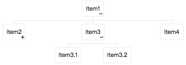
<zscript><![CDATA[
DefaultTreeNode root = new DefaultTreeNode(null, new DefaultTreeNode[]{
   new DefaultTreeNode("Item1", new DefaultTreeNode[]{
      new DefaultTreeNode("Item2", new DefaultTreeNode[]{
         new DefaultTreeNode("Item2.1")
      }),
      new DefaultTreeNode("Item3", new DefaultTreeNode[]{
         new DefaultTreeNode("Item3.1"), new DefaultTreeNode("Item3.2")
      }),
      new DefaultTreeNode("Item4")
   })
});
DefaultTreeModel model = new DefaultTreeModel(root);
model.addOpenPaths(new int[][]{{0}, {0, 1}});
]]></zscript>
<organigram width="600px" model="${model}"/>
Open
As shown in the image above, if Orgitem has an Orgchildren a “+/-” icon will appear at the bottom right of the node. The user can open and close the item by clicking the “+/-” icon. Once the user has opened or closed the item, ZK will fire an OpenEvent to the related Orgitem.
Selection
Organigram supports single selection. Once the user selects an Orgitem, the color of the item will change and ZK will fire a SelectEvent to Organigram. Organigram also provides an API to get the selected item.
The following example demonstrates how you can set selection and open status.
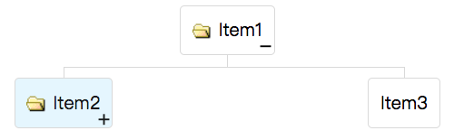
<organigram width="600px">
    <orgchildren>
        <orgitem image="img/folder.gif" label="Item1">
            <orgchildren>
                <orgitem image="img/folder.gif" label="Item2"
                         selected="true" open="false">
                    <orgchildren>
                        <orgitem label="Item4"/>
                    </orgchildren>
                </orgitem>
                <orgitem label="Item3"/>
            </orgchildren>
        </orgitem>
    </orgchildren>
</organigram>
My colleague Robert recently released a CSS-Flex based Orgchart approach on DZone. Using this new Organigram component is an even easier way to add a Orgchart to your ZK app. However, the styling techniques that Robert mentioned in the article can also be applied in the Organigram component to polish the look & feel, if you are interested please refer to Fully Styled Example section in the DZone article.
I hope you find this new component useful. If you have any feedback or comments, please feel free to share with us!
AWESOME !…When will it be released please ?
sweet i will need by sure
This new component is already in the latest 8.6 freshly, try out here: https://www.zkoss.org/download/freshly/ or visit the maven eval repo. Let us know how it works for you!
Is there any simple way to vertically align the last items ?