Introduction
In the upcoming ZK 9, we will introduce a new component: Inputgroup.
It is inspired by Bootstrap’s Input group and Button group. By prepending or appending some components to the input component, you can merge them like a new form-input component.
Example
Basic example
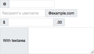
The following code shows the basic usage of this component.
<inputgroup>
	@<textbox />
</inputgroup>

<inputgroup>
	<textbox placeholder="Recipient's username"/>@example.com
</inputgroup>

<inputgroup>
	$<textbox/>.00
</inputgroup>

<inputgroup>
	With textarea
	<textbox multiline="true" rows="5" cols="30"/>
</inputgroup>
Buttons, checkboxes, and radios
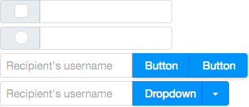
The components to be prepended or appended can be buttons, checkboxes, or radios.
- Buttons:
Button, Combobutton, and Toolbarbutton
CheckboxRadio
<inputgroup>
	<checkbox/>
	<textbox/>
</inputgroup>

<inputgroup>
	<radio/>
	<textbox/>
</inputgroup>

<inputgroup>
	<textbox placeholder="Recipient's username"/>
	<button label="Button"/>
	<button label="Button"/>
</inputgroup>

<inputgroup>
	<textbox placeholder="Recipient's username"/>
	<combobutton label="Dropdown">
		<menupopup>
			<menuitem label="Action"/>
			<menuitem label="Another action"/>
			<menuitem label="Something else here"/>
			<menuseparator/>
			<menuitem label="Separated link"/>
		</menupopup>
	</combobutton>
</inputgroup>
Button group

You can group a series of buttons together just like a Button group.
<inputgroup>
	<button label="Left"/>
	<button label="Middle"/>
	<button label="Right"/>
</inputgroup>

<inputgroup>
	<button label="1"/>
	<button label="2"/>
	<combobutton label="Dropdown">
		<menupopup>
			<menuitem label="Dropdown link"/>
			<menuitem label="Dropdown link"/>
		</menupopup>
	</combobutton>
</inputgroup>
Vertical variation
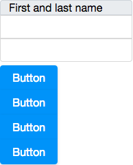
The default orientation is horizontal. You can change the orientation to vertical to make components stack vertically.
<inputgroup orient="vertical">
	First and last name<textbox/><textbox/>
</inputgroup>

<inputgroup orient="vertical">
	<button label="Button"/>
	<button label="Button"/>
	<button label="Button"/>
	<button label="Button"/>
</inputgroup>
Let us know how you like this component. We’ll release more articles of new components in ZK 9. Stay tuned!
Great component…
Hi
I think it is better to use a user interface as a bootstrap than to make components without rhyme or reason
or create your owner components but in an easier way.
best regrds
Hi.
Definitely, you can use Bootstrap or similar front-end frameworks to work with ZK. But you can make life easier with the out-of-the-box components in ZK.
And yes, you can use a macro to build your own Inputgroup in ZK if you don’t like the built-in one.