Introduction
The Web and mobile development market are growing rapidly with more and more enterprises needing a strong presence on both platforms. This leads to a need for significant time and money investment creating applications which fulfil the needs of both platforms.
Most vendors provide separate component set for touch devices does not alleviate the problem of having to write two or more applications which support different devices. The fact that multiple applications or multiple pages for each view have to be written introduces a lot of cost and risk to the project which is not good for an uncertain enterprise mobile market.
With ZK 6.5 this pain is alleviated as we not only implemented responsive web design but have taken it further to enable developers to provide an optimal user experience across all devices without writing two applications or using multiple pages. This is a big plus for developers that want to create a tablet or smartphone application but do not want to spend time and money implementing two separate applications or sets of pages using different component sets.
The following diagram outlines the differences between other approaches and ours.
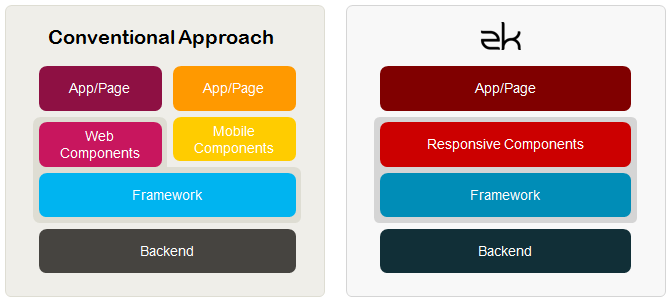
The diagram demonstrates how we take Responsive Design principles further.
Taking responsive web design further
With ZK 6.5 we have taken Responsive Design further to enable developers to provide an optimal user experience across all devices without writing two applications or using multiple pages.
This is a big plus for developers that want to create a tablet or smartphone application but do not want to spend time and money implementing two separate applications or sets of pages using different component sets. This is handled using our Responsive Components along with Responsive Design.
Responsive Design & Responsive Components
ZK 6.5 affords developers the ability to write one application and have it provide an optimal experience on any kind of device from the desktop to smartphones. This is device transparency. Device transparency is achieved using two techniques.
Responsive Design
ZK 6.5 fully supports responsive design and provides developers with the ability to use the latest cutting edge techniques including CSS3 to develop your applications so they will be optimized for different screen sizes and resolutions that one would find on desktop monitors, tablets and smartphones.
Responsive Design accounts for positioning of components on multiple devices. However, in addition to the layout working on multiple devices, users need components which transparently provide an optimal user experience for each device. Enter Responsive Components.
Responsive Components
Responsive components radically changing their behaviour to best suit the device that they are on, thus reinforcing device transparency.
Responsive component changes include seamless mouse event and touch event support depending on the device, default touch events for many components including but not limited to swipe gestures to change page in the grid, touch scrolling support, opening and closing layouts using touch and many more.
Summary
Device transparency is enforced using responsive design and responsive components which combine to provide ZK developers with the ability to write an application once and have it be optimized for different devices and platforms, such as desktop browsers, tablets and smartphones.
This is a massive advantage to developers who want to save time and money by having one application which through the help of ZK can automatically adapt to whichever platform or device that they use.
Device transparency builds on ZK’s history of producing cutting edge technology which lightens the load of developers all around the world. ZK continues to help developer’s by abstracting away their pain adding to our transparent Ajax & Java technology which enables you to write Ajax applications without knowing the communication details and control the browser using Java without the need for JavaScript.
Resources
Great new features, but why only available in EE and not in CE? That would be much more help to spread the zk-Framework in the mobil world!
Where do you see EE vs CE in relation to mobile?
look at features: http://www.zkoss.org/whyzk/Features
Responsive components/enhancement exp are for EE only.
@Mark, are you talking from creation of a feature perspective?
If so then everything that is done in EE can be done in CE, the advantage is EE comes with components which adapt to the different platforms. This can be done in CE of course (and we would encourage our community to get involved in this) and basically comes down to time vs money.
If you have the time to implement additional features then please do so, if you don’t want to spend the time then EE is available for you.
Here is a good article about how to apply ZK’s responsive design.
http://books.zkoss.org/wiki/Small_Talks/2012/November/How_to_Apply_Responsive_Design
Just coming out from under the rock and learning everything related to web. Aaarghhh! Did visit you at zkoss.org, the demo portion looked familiar and kinda helped me get my bearings. Will continue to learn, hopefully from y’all. Thanks.
[…] Artículo original de Timothy Clare […]