In addition to these bigger projects, you can give a fresh feeling for your whole application with just a few simple CSS classes and without changing much to your theme or your project’s structure.
General concepts
As you may already know, a ZK component is a Java object that exists in the web server hosting your application. This component has a direct representation at client-side, the ZK Widget. This widget is a JavaScript Object which hold states and communicates with the server-side Component.
The widget itself is represented by one or more DOM tree nodes. These are html <tag> which make up the actual visible page.
A simple widget such as a ZK <div> will be represented in the DOM tree by a single DOM tree node <div>…</div>.
A more complex component, such as listbox may be represented by a collection of many DOM tree nodes such as:
As you can see from the listbox above, the main nodes of ZK Widgets will usually have a class=”z-widgetclass” attribute.
For example, a <div class=”z-div”> is generated by a ZK div widget, etc.
There is another way to retrieve ZK information from a DOM element. We can use the element ID to run the ZK selector JavaScript function in order to retrieve the widget associated with a DOM node.
For example, given the DOM node <div id=”abc123” zclass=”z-div”>, we can use the javascript console to retrieve the widget with zk.$(“#abc123”).
Our task here is to update the style of specific ZK components in order to refresh the look and feel of our page.
Some ZK components are more suitable to that end than others. Any component with a small style footprint will be useful. ZK div, label, vlayout and hlayout are great candidates, because they generate simple DOM nodes, with few default styles.
By contrast, more complex and powerful components such as window, groupbox or listbox come with more existing out-of-the-box styles and will require more effort to customize. It is possible to do so if needed and can be the right choice if we need a specific feature such as the closable feature on window.
Leveraging ZK native classes
As we saw above, ZK components come with built-in classes. This can be used to our advantage. If we want to style-up every panel in our zul page, we do not have to go through every-single one of them to add a custom sclass. Instead, we can simply use the z-panel class in our CSS code, and we can define custom styles for every single instance of this component in our page.
Putting it all together
How do we do this, technically?
Adding a stylesheet
There are many ways to add a stylesheet to our pages.
If we want to add stylesheet on a single page, we can simply declare it using the <style> element or the <?link rel="stylesheet" type="text/css" href="/style.css"?>initiator in the zul page itself.
Alternatively, we can use lang-addon.xml to declare a global style, which will be imported in every page of our application.
The actual CSS
What do we put in this stylesheet?
Good news: the sky is the limit.
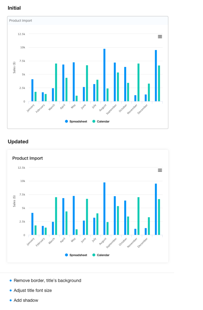
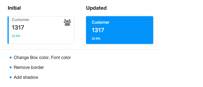
You can simply add subtle variations to a component, such as adding colors, shadows or borders. You can go wild and create a fully styled template from basic blocks such as div and text content.
The actual design will depend on your application, and own style ideas and requests.
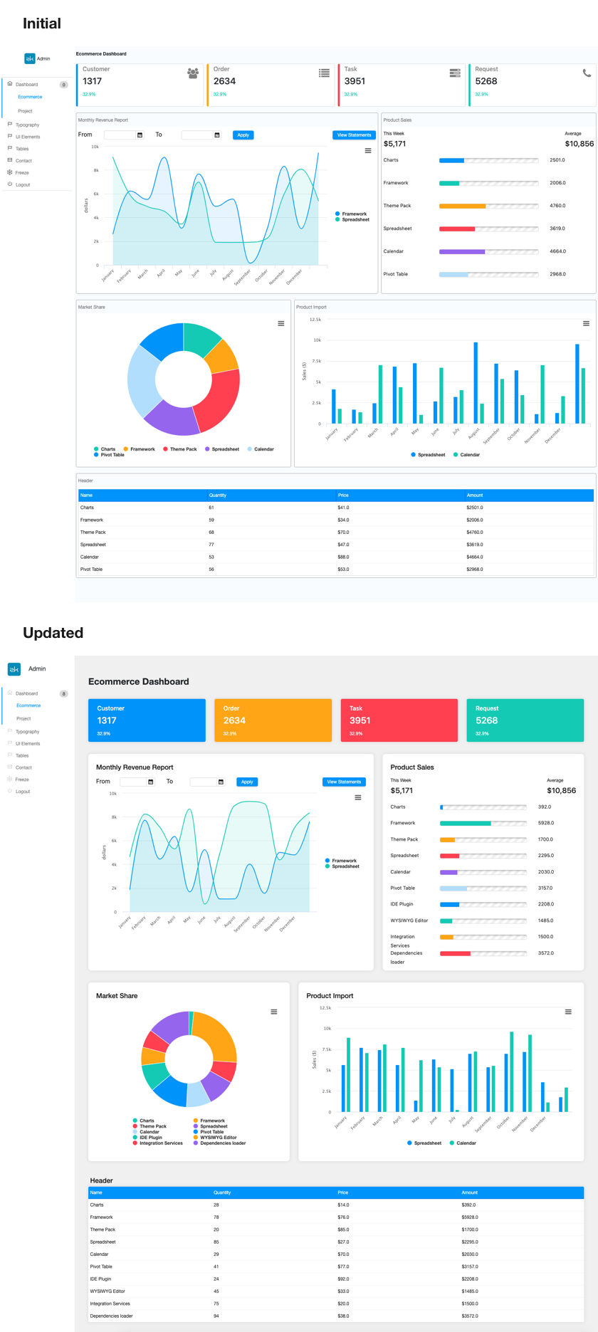
I have made a few samples showing how simple CSS sheets could be applied to existing pages in order to highlight the changes that can be done with a small extra touch.
You will find them in the “customStyle” branch of the ”admin-template” Github repository located here.
Since I’m taking the option of adding my custom styles only to this page specifically, I’ve added the link to the stylesheet as an initiator.
If we now look at the content of this stylesheet, we will see a few useful patterns. The first section simply use normal classes defined on the component during page creation.
Here for example, we use the state-box class, as defined in zul in the stateBox.zul template. Without changing anything to our design, we can piggyback the style update on our available classes.
In the same stylesheet, we also see an example of ZK component style customization. The panel component is provided out of the box with a small border, but if our design calls for it, we can simply remove it from every single panel in the page with a single CSS line:
 .z-panel {
	border: none;
}
Everything else is client-side design. Do you want to add a border to add structure to to some component, or do you think listbox should have a drop shadow?
Maybe you want to add a specific color shade for titles, or change their default font size?
All of these small but impactful client-side customizations can be done in a few lines of standard CSS.
A look at the result
Conclusion
We have seen how the experience of a ZK page can be modified with only a few lines of CSS code to provide a different look-and-feel.