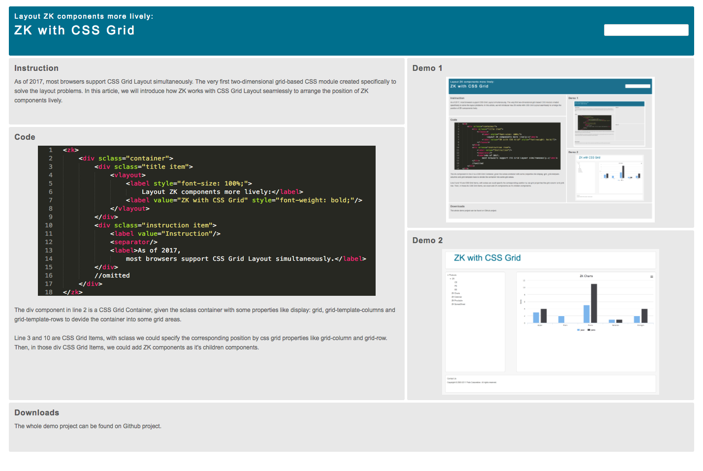
Introduction
As of 2017, most browsers start to support CSS Grid Layout simultaneously. It is the very first two-dimensional grid-based CSS module created specifically to solve the layout problems. With CSS Grid Layout, users can easily build more dynamic, asymmetrical layouts, and control both columns and rows at the same time. Below we will show you how ZK works with CSS Grid Layout seamlessly and lively!
Layout ZK components with CSS Grid
Examples
Example 1
Example 2

The strategy is very simple: a CSS Grid Container should be set to a zk <div> component. Furthermore, every CSS Grid Items is required to be a <div> component, which we put all kinds of ZK components inside.
ZUL
<zk>
	<style>
		.container {
		    display: grid;
		    grid-gap: 20px;
		    grid-template-columns: 1fr 8fr 19fr 1fr;
		    grid-template-rows: repeat(3, min-content) 1fr;
		}

		.header {
		    grid-column: 2 / 4;
		    grid-row: 1 / 2;
		}

		.calendar {
		    grid-column: 2 / 3; //css grid properties
		    grid-row: 2 / 3; //css grid properties
		}
	<style>
    <div sclass="container">
        <div sclass="instruction item">
            <label value="Instruction"/>
            <separator/>
            <label>As of 2017, //omitted </label>
        </div>
        <div sclass="header item">
            <div sclass="header-left">
                <vlayout>
                    <label style="font-size: 100%;">
                        Layout ZK components more lively:
                    </label>
                    <label value="ZK with CSS Grid"/>
                </vlayout>
            </div>
            <div sclass="header-right">
                <chosenbox hflex="1" creatable="true"/>
            </div>
        </div>
	    // omitted..
	</div>
</zk>
- Line 20: The
<div> component is a CSS Grid Container, applied by sclass container including some properties like display: grid, grid-template-columns and grid-template-rows to divide the container into some grid areas.
- Line 21 and 26: These
<div> components are CSS Grid Items. With sclass we can specify the corresponding position by css grid properties like grid-column and grid-row. Thus, in those <div> CSS Grid Items, we can add ZK components as its children components.
Downloads
The whole demo project can be found on Github project.