Anchorlayout is a component where the size of its children components can be made dependent on the size of the parent components. When the parent component’s size is changed, its child components will also re-size itself accordingly.
Version:1.0.0
ZK Version: applicable to 5.0.0 later
Usage:
The anchor property of anchorchildren can be used to assign the size relationship between the parent component (anchorlayout) and the child component (anchorchildren). specify one (for width) or two (for width and height) parameters in “anchor” separated by a space. The value can be an absolute number or in percentage (%). For example, if parameters of “50% -200” are specified, the “50%” represents the width of the child component which means that the child component’s width will always be 50% of the parent component’s width and will change accordingly each time the parent component is resized. On the other hand, “-200” represents the child component’s height, it means that the child component’s height will always be 200pixels less than the height of the parent component and will change accordingly each time the parent component is resized.
Normally, with hflex and vflex, these two attributes distributes the remaining space after computing the default width and height of components. However, with anchorlayout components, the width and height of anchorlayout is firstly determined, the size of anchorchildren will then be calculated accordingly. Therefore, when the size of the browser is narrowed down too much, in the case of hflex, there will be no more space to distribute and a horizontal scroll bar will appear whereas in the case of anchorlayout, the child components just shrinks accordingly.
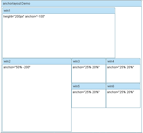
Here is a sample snippet,
						height="200px" anchor="-100"


						anchor="50% -200"


						anchor="25% 20%"


						anchor="25% 20%"


						anchor="25% 20%"


						anchor="25% 20%"

Download:
Excellent.
It was exactly what I needed.
Thank you.
Hi Peter,
nice work. But why not put it in the CE edition. So many developers like me can access it through the maven build system.
Thanks
Stephan