Introduction
ZK Charts has now been upgraded to version 2.1!
This upgrade comes with new features like box plot, tree map, polygon series, new options for existing chart types, and improved javadoc.
If you are not familiar with the ZK Charts component, please check out ZK Charts for more information.
Now let’s take a closer look at the new features.
Box Plot
Box plot provides a quick way to show the five-number summary (minimum, first quartile, median, third quartile, and maximum) of a data set.
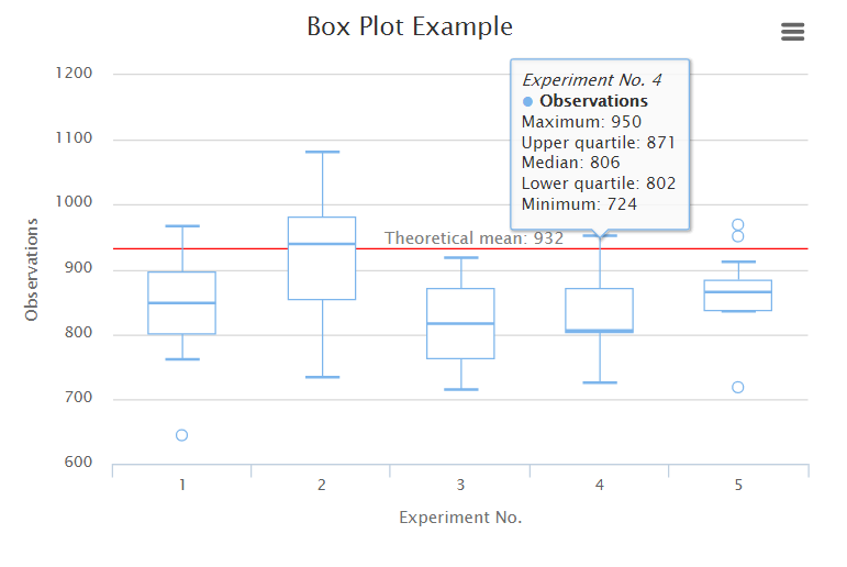
You can visualize your five-number summary data easily using the newly added BoxPlotModel.
BoxPlotModel model = new DefaultBoxPlotModel();
model.addValue("Observations", 760, 801, 848, 895, 965);
model.addValue("Observations", 733, 853, 939, 980, 1080);
model.addValue("Observations", 714, 762, 817, 870, 918);
model.addValue("Observations", 724, 802, 806, 871, 950);
model.addValue("Observations", 834, 836, 864, 882, 910);
Checkout box plot demo for live demo.
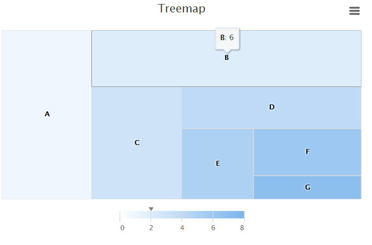
Tree Map
Tree map is best suited for displaying data with tree-like structure.
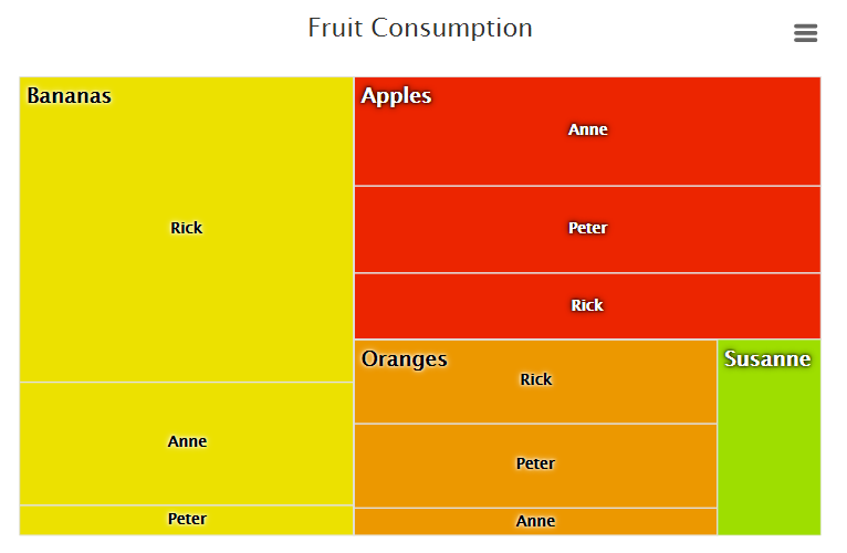
There are four different types of layout algorithm available, so you can choose the one that is the best fit for your data. We’ve got…
“slice and dice” (the default layout algorithm if not specified)
“squarified”
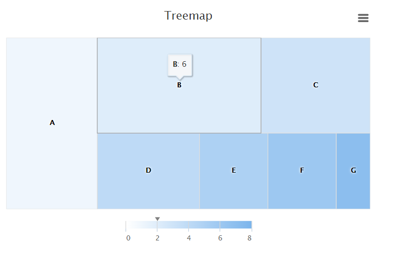
“stripes”
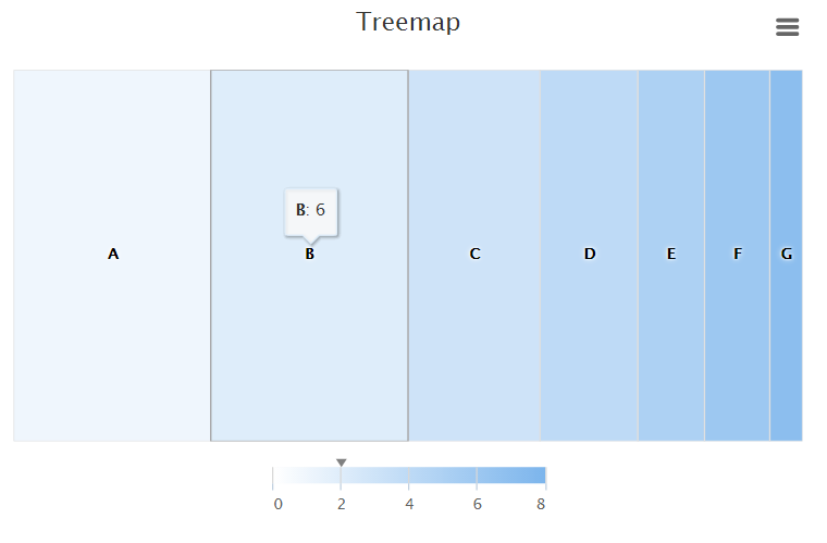
and “strip”
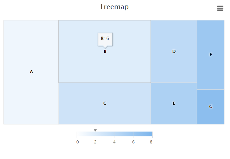
To specify the parent-child relationship between two data points, use the new setParent() method like:
Point parent = new Point();
parent.setId("Bananas");
parent.setValue(100);

Point child = new Point();
child.setId("Rick");
child.setValue(35);
child.setParent("Bananas");
For more information, please check out the three live demos for treemap: treemap demo, with levels, and large dataset
Polygon Series
Polygon series lets you draw any freeform shape on the chart. It is very useful when trying to highlight a certain area on the chart along with other existing data points, as shown in the image below.
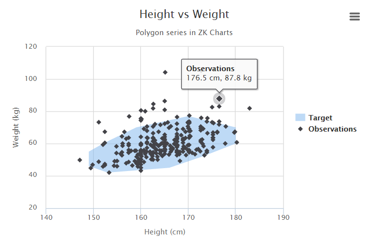
To define a polygon shape, simply create a series with “polygon” type. For example:
Series series = chart.getSeries(0);
series.setName("Target");
series.setType("polygon");
series.setColor("rgba(124, 181, 236, 0.5)");
series.setData(
    new Point(153, 42),
    new Point(149, 46),
    new Point(149, 55),
    new Point(152, 60),
    new Point(159, 70),
    new Point(170, 77),
    new Point(180, 70),
    new Point(180, 60),
    new Point(173, 52),
    new Point(166, 45)
);
Follow this link polygon demo for a live demo.
New Options
Lots of new options have been added in ZK Charts 2.1 to allow more customization and support new functionalities.
For example, AxisLabel now has an option called “autoRotation”, which allows you to specify the preferred angle that the label should rotate to prevent overlapping with each other.
The following code snippet sets four rotation degrees, which mean labels will be rotated using the smallest angle first; if labels still overlap, try the next angle.
AxisLabels axisLabels = chart.getXAxis().getLabels();
axisLabels.setAutoRotation(0, -10, -25, -45);
There are many more new options added; please check out our official release note and javadoc for more information.
Speaking of which…
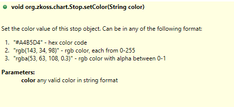
Improved Javadoc
We have improved ZK Charts API with methods that are more clear and convenient to use. Corresponding javadocs have also been updated with more examples. For instance, when setting the color stops on the Y Axis of a solid gauge chart, we can use the newly added “Stop” class directly. For example:
yaxis.setStops(
    new Stop(0.1, "rgba(255, 0, 0, 0.4)"),
    new Stop(0.5, "#DDDF0D"),
    new Stop(0.9, "#DF5353")
);
and the corresponding javadoc shows three different ways to specify color.