ZK 7 is an upcoming big release focusing on HTML5 & CSS3. Simplified by reducing the DOM structure and JavaScript code, ZK 7’s theme will be more easily customizable than previous versions and its JavaScript code running more efficiently than ever. ZK 7 will also support CSS3’s icon font feature bringing the great benefits of being able to scale, change colour and include shadows to your icons easily and conveniently . In the following demo, we will show you how you can customize a theme to look like ones coming from Wrapbootstrap (a marketplace for twitter bootstrap).
Bootstrap Theme Support – In ZK 7, you can apply twitter bootstrap themes to ZK seamlessly, such as Button, Group Button, and Layout System, without breaking the components’ functionality and look & feel.
LESS Support – The theme of ZK 7 is based on LESS, a dynamic stylesheet language, to generate the css.dsp file for ZK 7 to use.
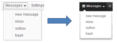
Icon Font Support – With this feature, you can use the setIconSclass method to specify the icon font for a component, which is extended from LabelImageElement class, or, use built-in icons from ZK 7, which is integrated with Font Awesome
CSS3 Support – Since ZK 7’s theme is totally revised by CSS3 features including gradient, box-shadow, border-radius etc, users can now customize their themes with CSS3 pretty much instantaneously.
Demo
In this demo, we customize the page with Pure ZK and CSS3. There are three different coloured themes and they are able to be switched dynamically without having to reload the whole page.
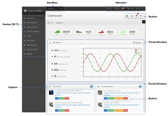
Design phase – Normally, the design comes from a web designer or artist; In this case we choose the unicorn-admin-template from Wrapbootstrap.
Analyze phase – In this phase, we need to choose the right ZK components accordingly to layout the whole page as illustrated below:
Implement phase – After analyzing the page, we can now add some ZK components with corresponding CSS classes to layout the structure of the page. For example,
<div sclass="header">
	// The Header Content
</div>
<div sclass="search">
	// The Search Content
</div>
<div sclass="user-nav">
	// The User-Navigation Content
</div>
<navbar orient="vertical" sclass="sidebar">
	// The Sidebar Content
</navbar>

<div sclass="style-switcher">
	// The Style-Switcher Content
</div>

<div sclass="content">
	<div sclass="content-header">
		// The Dashboard Content
	</div>
	<div sclass="breadcrumb">
		// The Breadcrumb Content
	</div>
	<include src="zk/content.zul" />
</div>
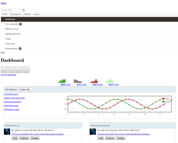
Customize phaseBelow is what a base layout with a normal ZK theme would look like:
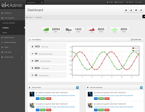
After applying the bootstrap CSS file and the customized CSS file which is referred from Wrapbootstrap, we can get the following result.
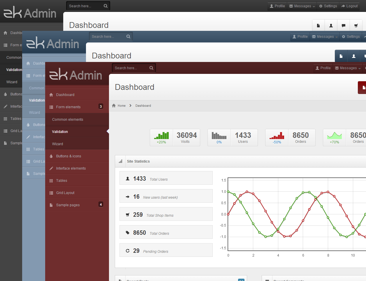
Three different coloured themes illustrated below:
As you can see from the above, the iconSclass attribute is a new feature of ZK 7 to support icon CSS, rather than using the src attribute that supports image URLs only.
LESS File
.navpp.z-menupopup {
	// change the background style
	background: #FFF;
	.borderRadius('5px');
	.boxShadow('0 5px 10px rgba(0,0,0,0.2)');
	padding: 0;

	.z-menupopup-content {
		padding: 6px 0;
	}

	// disable the unused style
	.z-menupopup-separator,
	.z-menu-image,
	.z-menuitem-image {
		display: none;
	}

	// change the effect of menu and menuitem
	.z-menu-content,
	.z-menuitem-content {
		padding: 3px 20px;
		line-height: 14px;
		* {
			text-shadow: none;
		}
		&:hover,
		&:active {
			color: #FFF;
			border-color: transparent;
			.borderRadius('0');
			.boxShadow('none');
		}
	}

	// add a top arrow at the top of the popup
	&:before {
		position: absolute;
		top: -7px;
		left: 9px;
		display: inline-block;
		border-right: 7px solid transparent;
		border-bottom: 7px solid #FFF;
		border-left: 7px solid transparent;
		border-bottom-color: #FFF;
		content: '';
	}
}
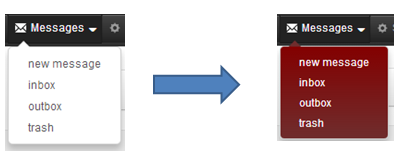
If we want to change the popup to red like the image below, we simply add the following CSS.
I was trying to ZK – Preview with other bootstrap theme and i can’t force ZK components to use bootstrap styles. Is there any chance you could share source code of this example? Off course, without bootstrap theme, just zk source code.
Thanks indeed! Awesome new features!
That’s a great improvement, congratulations! But I don’t get how bootstrap can be _seamlessly_ applied. Let’s say I have an application developed in ZK 6.5, without any css customization: how can I get default Bootstrap overriding ZK theme?
Please refer here – https://github.com/jumperchen/ui-examples
About the layout design is owned by diablo9983, please Do Not use this project into your own project directly.
What’s the best migration strategy? We have themes that we have customized and not changed much since at least ZK 5.0. If we want to move to the new approach, what are the steps?
For example, we had changed the colors in the CSS files and on some of the images (first using the theme-changing tool, and then tweaking a bit by hand). Should we start with a new bootstrap theme and make try to make changes? How does the bootstrap theme play with the CSS in the various ZK-specific css file?
From this example I can’t figured out how to get example look like on the pictures. Is code on Github incomplete because of Unicorn Template? I can get something like on the picture below ‘Customize phase’.
And, as I can understand, there are no themes for zk and bootstrap? So if I want to move to this framework I should rewrite everything in the application?
And are you planning for Step-by-Step guide how to move old app to bootstrap?
Hi,
I downloaded the demo but the styles are not working well. If I look at the browser console it says:
! Invalid CSS rule at: <
! Invalid CSS property declaration at $ (repeated 11 times)
great news!! it was the biggest missing point: css to make look nicer a zk app!
Finally ZK gets nice modern designs. And easily customized. Wow!
I was trying to ZK – Preview with other bootstrap theme and i can’t force ZK components to use bootstrap styles. Is there any chance you could share source code of this example? Off course, without bootstrap theme, just zk source code.
Thanks indeed! Awesome new features!
Please, check in the code for the sample application.
I cannot see how these work together without the codes.
thanks
Stephan
Yes, we will commit the source code to github.
That’s a great improvement, congratulations! But I don’t get how bootstrap can be _seamlessly_ applied. Let’s say I have an application developed in ZK 6.5, without any css customization: how can I get default Bootstrap overriding ZK theme?
please check in the code.
where is the code for the sample application?
Please refer here – https://github.com/jumperchen/ui-examples
About the layout design is owned by diablo9983, please Do Not use this project into your own project directly.
thanks for the demo, getting error on following path entry when importing in eclipse, pls advise
Thanks for the demo project.
When I import in eclipse I am getting error with the following path entry
Was there something missed during check in?
I fixed that, please update the source again
What’s the best migration strategy? We have themes that we have customized and not changed much since at least ZK 5.0. If we want to move to the new approach, what are the steps?
For example, we had changed the colors in the CSS files and on some of the images (first using the theme-changing tool, and then tweaking a bit by hand). Should we start with a new bootstrap theme and make try to make changes? How does the bootstrap theme play with the CSS in the various ZK-specific css file?
Our application has customized a ZK theme and works in ZK 6.0.1
What steps would be needed to migrate this?
How does the bootstrap theme work with the CSS in ZK-specific files?
Is bootstrap optional?
Will ZK7’s approach be compatible with IE7 and up?
@Darius, the current target is for IE8+
Great to have all the new features!
But will they will be available for ZK CE?
From this example I can’t figured out how to get example look like on the pictures. Is code on Github incomplete because of Unicorn Template? I can get something like on the picture below ‘Customize phase’.
And, as I can understand, there are no themes for zk and bootstrap? So if I want to move to this framework I should rewrite everything in the application?
And are you planning for Step-by-Step guide how to move old app to bootstrap?
@Dracontis,
You may take a look at this blog – http://blog.zkoss.org/index.php/2013/09/03/zk-7-zk-components-x-bootstrap-3/
And all of that features will be released with an Open Source License.
There is a bug in js script in demo project:
$(window).bind(“popstate”, function(e) {
var theme;
e = e.originalEvent;
if (e.state && (theme = e.state.theme)) {
changeTheme(theme, true);
}
});
…..
I believe should be
theme == e.state.theme
Hi,
How can I download this demo from github??I’m not using maven!
Hi,
How can I download this demo??I’m not using maven!
Hi,
I downloaded the demo but the styles are not working well. If I look at the browser console it says:
! Invalid CSS rule at: <
! Invalid CSS property declaration at $ (repeated 11 times)
For example in the file grey.css.dsp
Can i convert this template to BOOTSTRAP 4 version. I an newbie in admin template design. Please give me any suggestion.